Designing the Supplier Insights Dashboard
As a Freelance Product Designer at GetYourGuide, I spent six months creating a new insights and analytics feature for the B2B Supplier Portal. The goal was to give providers meaningful visibility into their performance so they could understand their business better, identify opportunities, and take informed actions to improve results, ultimately benefiting both suppliers and the marketplace.
The Problem
Before this project, the Supplier Portal offered very limited analytics, leaving providers with almost no understanding of how their products performed over time. Many smaller businesses struggled to interpret data on their own, while advanced, data-driven suppliers felt restricted by the lack of depth and flexibility. We also needed to clarify which insights were most valuable, what data the platform could reliably provide, and how each metric could translate into actionable steps. The core challenge was to design a single system that was simple enough for beginners yet powerful enough for sophisticated users, without overwhelming either group.
Goal
The aim was to create a clear and intuitive analytics experience that helped suppliers understand their performance, explore trends, compare their results over time, and take informed actions based on data. By presenting insights in a structured and accessible way, the feature needed to increase user engagement, support better decision-making, and contribute to stronger business outcomes for both suppliers and GetYourGuide.
Hypothesis
If suppliers were given a well-organized, interactive, and easy-to-understand analytics tool, they would be able to make more informed decisions, identify opportunities more quickly, and ultimately improve their performance. Increased supplier success would directly contribute to higher-quality offerings and greater marketplace impact for the company.
Responsibilities
I led the entire process from initial research to final implementation. This included auditing the existing analytics, conducting user interviews, and organizing cross-team workshops to understand which insights mattered most and what actions they should enable. I defined different user types based on their data literacy, translated research findings into design concepts, produced wireframes and prototypes, tested them with suppliers, and iterated until the experience aligned with both user needs and technical possibilities. Throughout development, I collaborated closely with engineering to ensure the final product matched the intended vision.
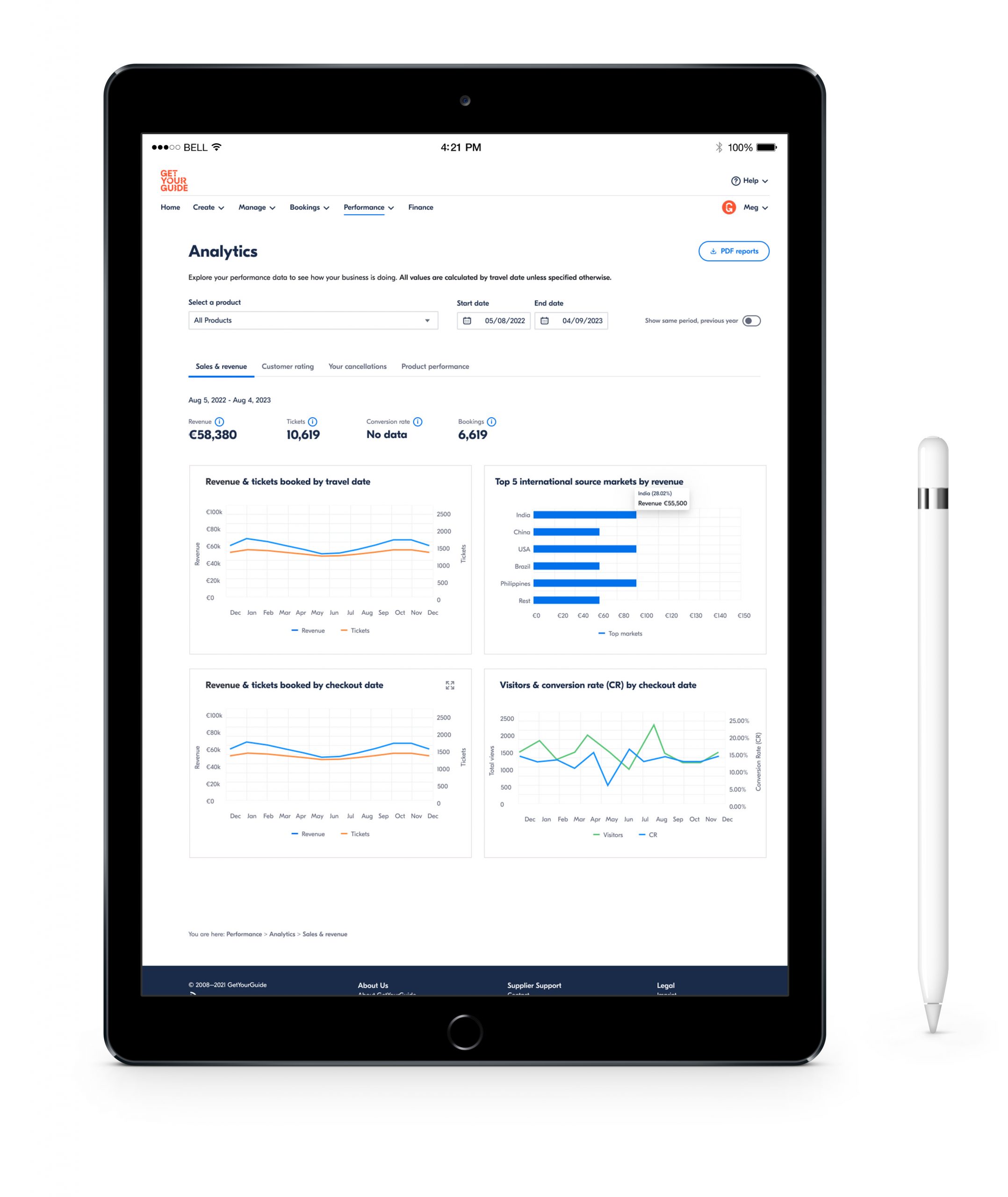
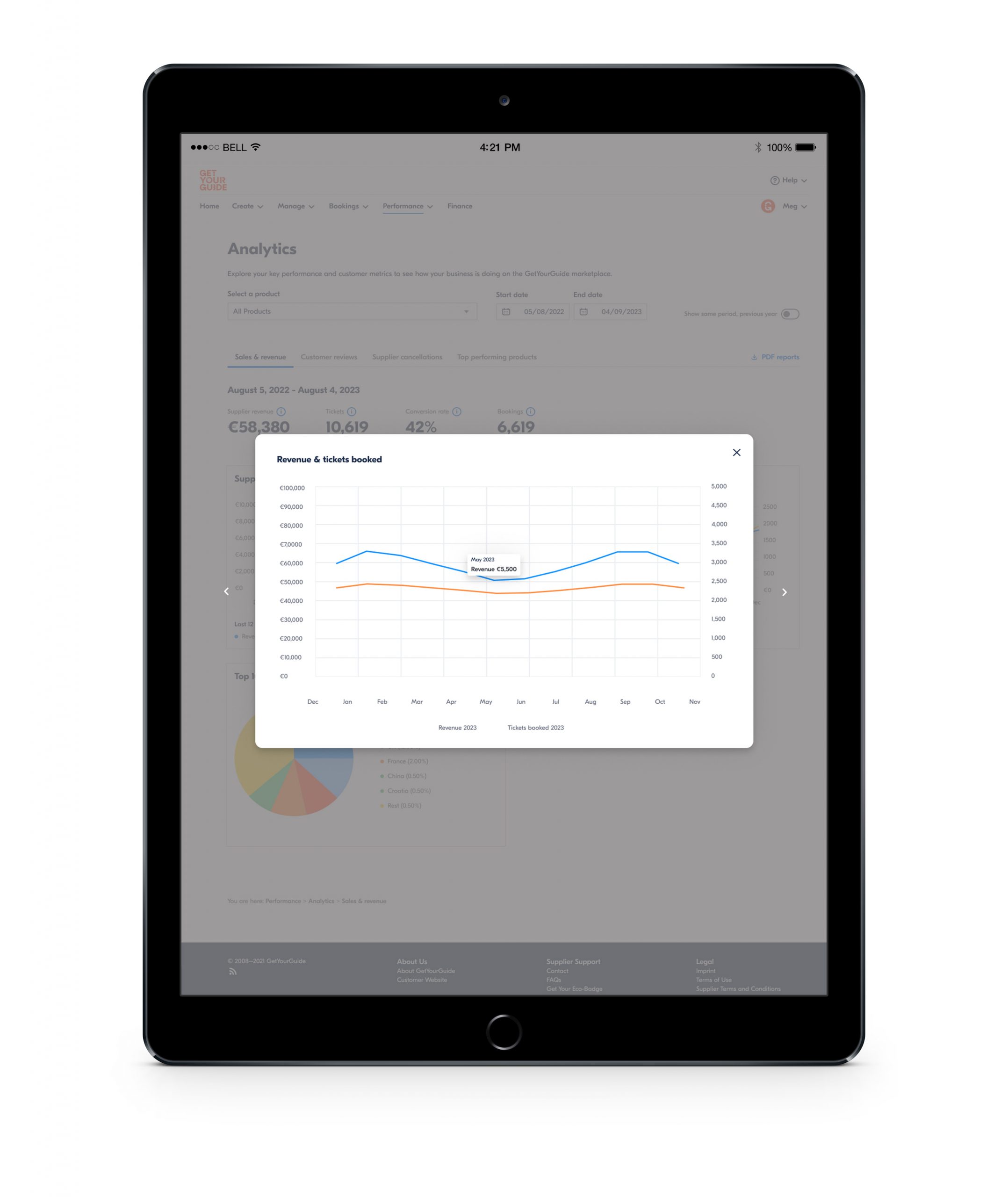
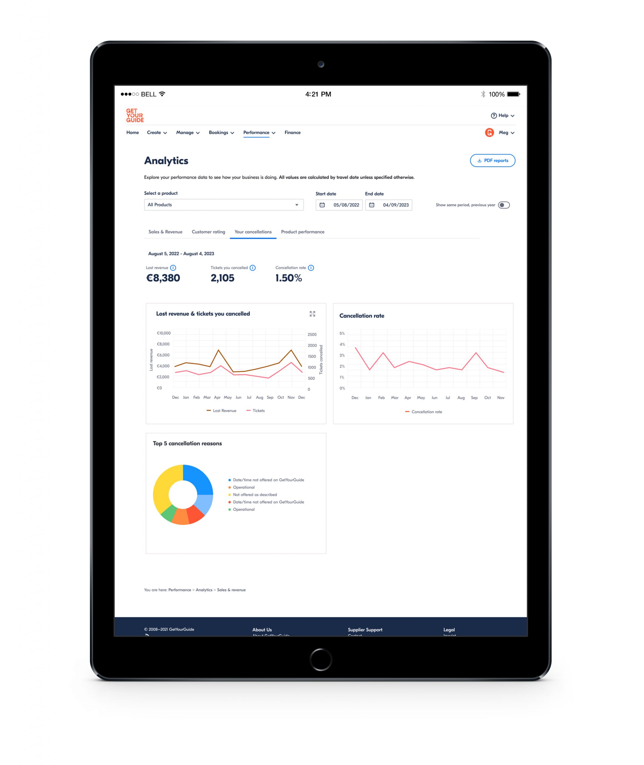
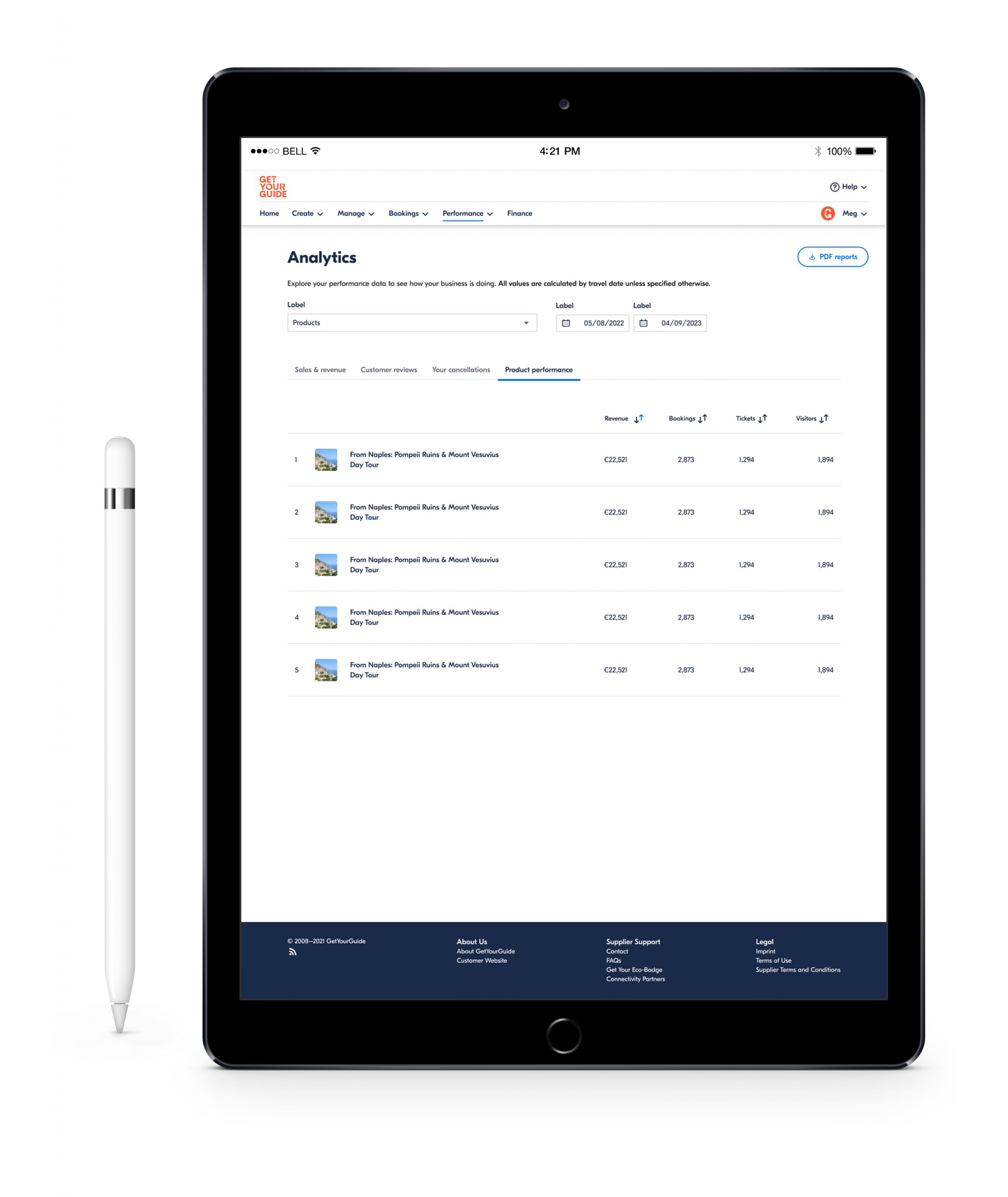
Final Design
The final solution was a modular, interactive dashboard organized around distinct categories of insights. It allowed suppliers to explore bookings, revenue, seasonality patterns, and customer behavior in a way that felt approachable yet informative. Users could compare different time periods, identify trends, and benchmark their performance against anonymized peers without compromising data privacy. The design used a layered approach that revealed depth only when needed, supporting experienced users while remaining simple and digestible for those who were less familiar with data analysis.
Client:
GetYourGuideYear:
2023/2024Industry:
Travel & TourismSector:
Tech | E-CommerceCategory:
Date:
November 22, 2025