Express Checkout with Apple Pay
As a freelance Product Designer at HelloFresh, I worked within the Growth & Conversion Optimization team. For this project I was assigned to the Payments squad to integrate Apple Pay to support a seamless and intuitive subscription purchase experience.
The Problem
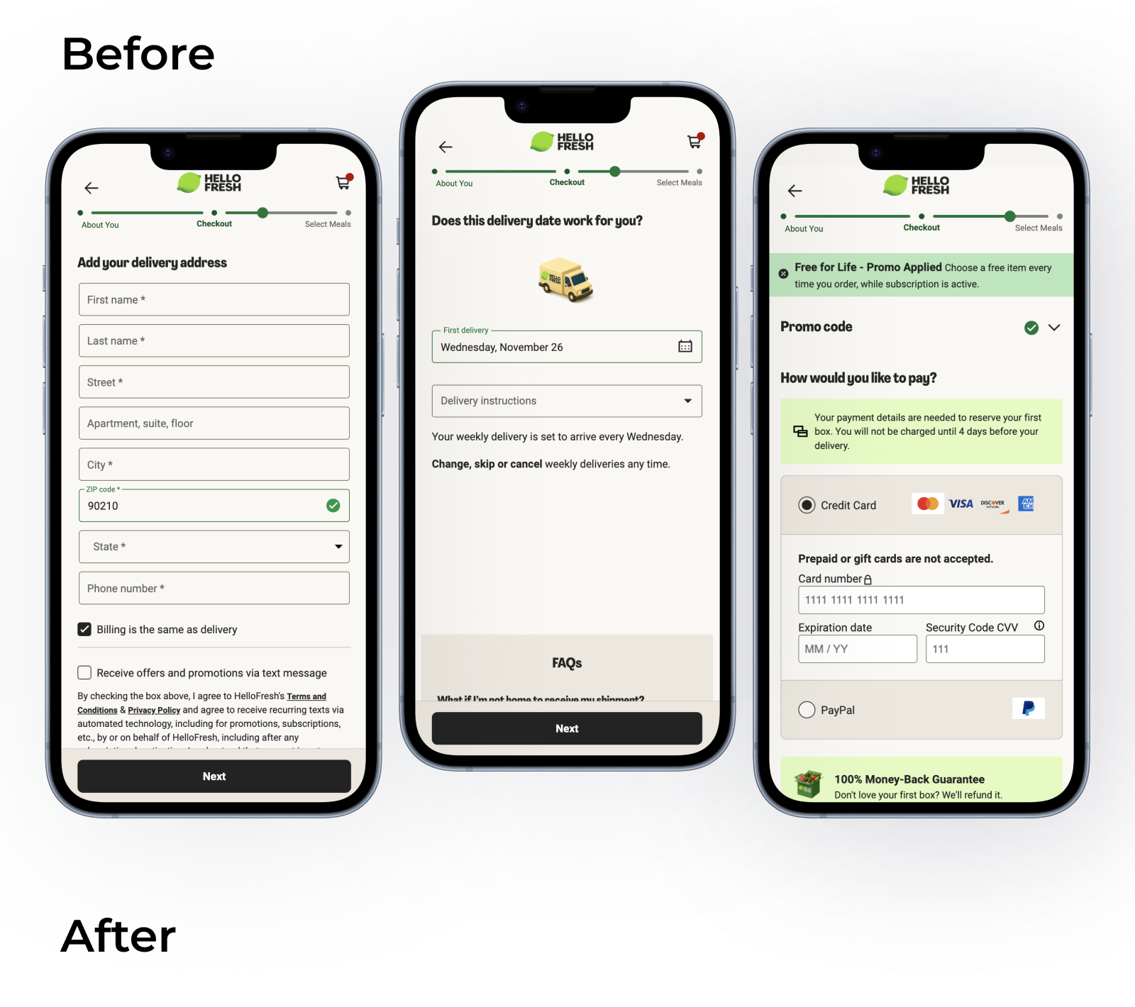
The HelloFresh checkout flow originally spanned three steps, each designed to reduce anxiety and support confident decisions.
Integrating Apple Pay required condensing all essential information onto a single screen while following Apple’s UI rules. This raised risks of visual clutter and cognitive overload, especially on mobile.
Combining reassurance content into one step – and accounting for market-specific differences – added further complexity.
Goal
The goal was to design a consolidated Apple Pay checkout screen that clearly communicates order, delivery, and pricing details while minimizing manual input and interaction effort. It needed to accommodate market-level variations without requiring separate designs, handle edge cases in a consistent and predictable way, and reduce friction throughout the process while maintaining a high level of trust and transparency.
Hypothesis
By consolidating only the most essential checkout information into a focused, well-structured screen – and leveraging Apple Pay to pre-fill user and payment details – users would be able to complete checkout more efficiently while maintaining the same level of transparency and confidence as in the original multi-step flow.
Designing for the most complex market first (highest legal + promotional density) would ensure the layout could scale down gracefully to markets with fewer content requirements – which represent most regions.
Responsibilities
My work focused on UX and UI design, conversion optimization, and prototyping – ensuring a seamless, accessible, and visually consistent experience across web and mobile. I refined and validated design solutions through iterative testing and supported the implementation process through to launch.
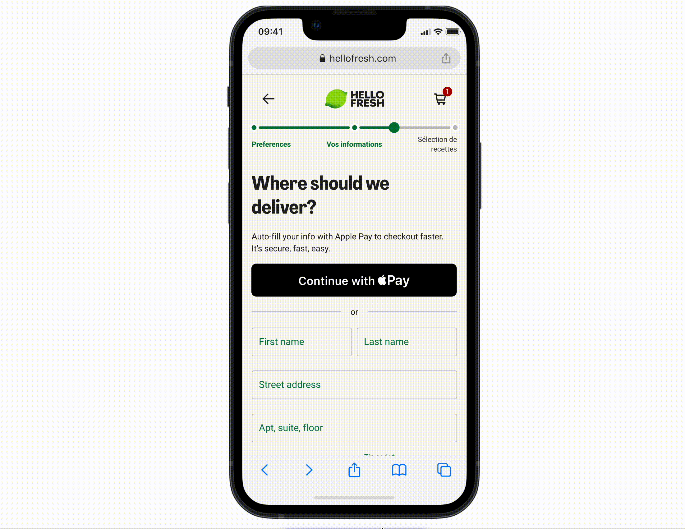
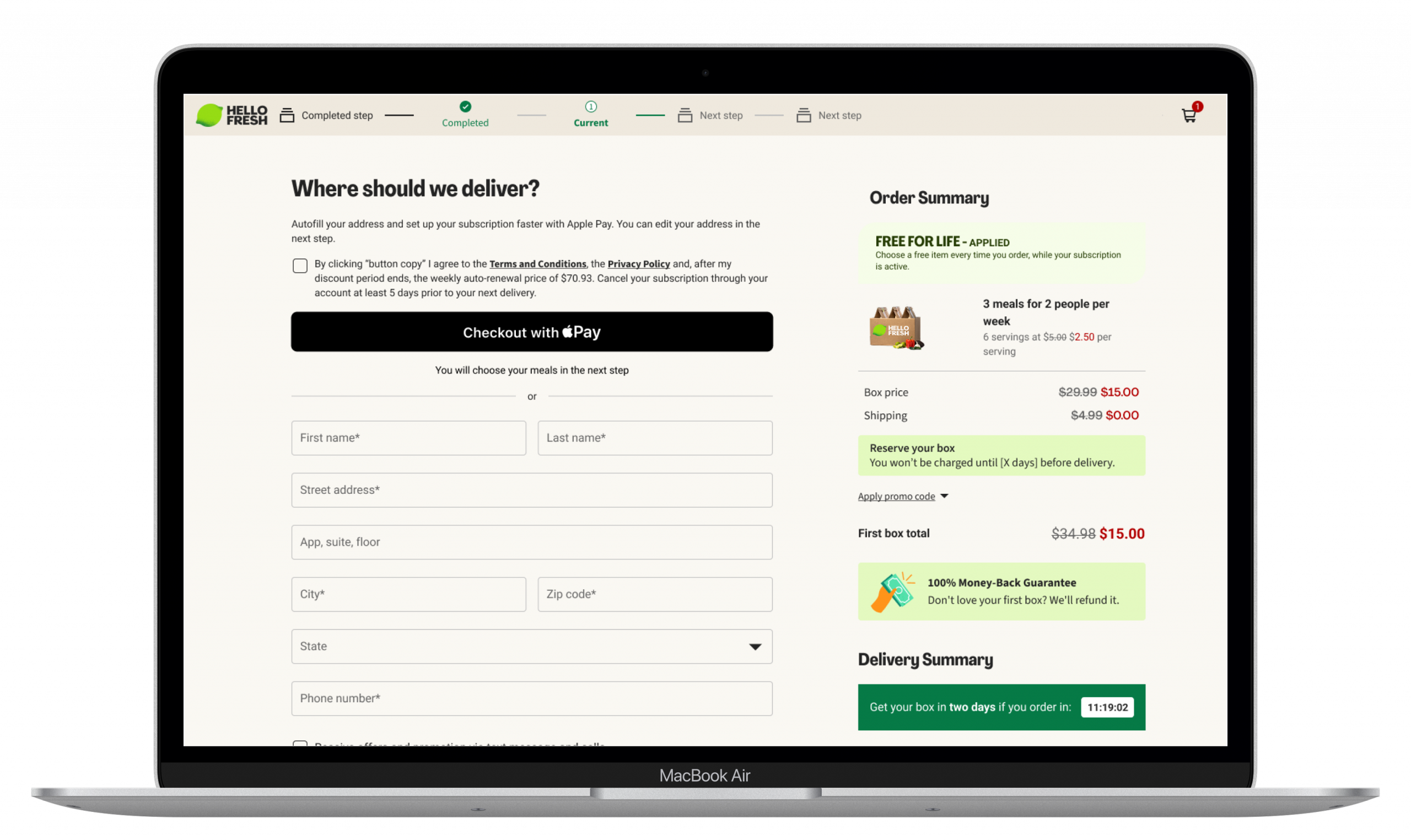
Final Design
The design followed a mobile-first approach, as most complexity occurred on smaller screens where the entire Apple Pay flow had to fit within a single vertical view. To reduce sticker shock and maintain a sense of calm, banners, promotions, and reassurance messages were limited so that only one would appear within the viewport at a time. This helped keep the experience visually balanced, minimized cognitive load, and allowed users to stay focused on completing their purchase with confidence.
Outcome
The implementation of Apple Pay was launched across selected markets just a few days before my contract ended. Therefore, I was not directly involved in monitoring performance or tracking post-launch conversion data.
Client:
HelloFreshYear:
2025Industry:
FoodSector:
Tech | E-CommerceCategory:
Date:
November 23, 2025